WPF ships with rich set of built-in controls. Controls in WPF can be broadly classified in 4 major categories.
1. Content Controls:
Controls that can hold a single piece of content. This content can be simple string or single nested UIElement.
Some example of Content Controls are Button, CheckBox, RadioButton, Label and so on.
All controls in this category derive from ContentControl base class. ContentControl base class has Content property which accepts single Object.
Let’s take an example of Button control.
Content property set to simple string
<Button Content="Home" Width="100" Height="100"></Button>
Content property set to UIElement which is Image control.
<Button Width="100" Height="100">
    <Button.Content>
        <Image Source="Images\Home.png"></Image>
    </Button.Content>
</Button>
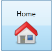
Content property set to StackPanel which hosts multiple child elements.
Suppose we wish to add 2 elements (TextBlock and Image) in Button control. But Button control is of type ContentControl and can contain single nested element. So in example below we add StackPanel as single nested element in Button control. StackPanel is layout control and can contain multiple nested elements. So we add TextBlock and Image in StackPanel.
<Button Width="100" Height="100">
    <Button.Content>
        <StackPanel>
            <TextBlock Text="Home" Margin="5" FontSize="14"></TextBlock>
            <Image Source="Images\Home.png" Stretch="None"></Image>
        </StackPanel>
    </Button.Content>
</Button>
We can observe in above example that WPF provides rich composition model.
How rendering works in Content Controls
If Content property is set to Object that don’t derive from UIElement then ToString() method is called to get and display the text.
If Content property is set to Object that derive from UIElement then UIElement.OnRender() method is called to display element.
2. Item Controls
Items Controls can contain multiple child elements.
Some examples of Items Controls are ListBox, ComboBox, Treeview, TabControl and so on.
All controls in this category derive from ItemsControl base class. ItemsControl base class has Items property to hold list of items.
Let’s take an example of ListBox control.
ListBox containing to list of string
<ListBox>
    <ListBoxItem>Apple</ListBoxItem>
    <ListBoxItem>Oranges</ListBoxItem>
    <ListBoxItem>Mango</ListBoxItem>
    <ListBoxItem>Grapes</ListBoxItem>
</ListBox>
Each item in ListBox control is ContentControl. In above example, ListBoxItem is a specialized type of ContentControl provided by framework for ListBox control. Hence we can replace ListBoxItem with any other control that derives from ContentControl. Below is one such example of replacing ListBoxItem with CheckBox.
ListBox containing list of CheckBox.
<ListBox>
    <CheckBox>Apple</CheckBox>
    <CheckBox>Oranges</CheckBox>
    <CheckBox>Mango</CheckBox>
    <CheckBox>Grapes</CheckBox>
</ListBox>
3. Layout Controls:
WPF introduced Flow based layout system instead of traditional co-ordinate layout system in windows forms.
WPF Layout system consists of different layout controls that are used to arrange child elements in Window.
These layout controls play an important role in determining position, size and orientation of child elements with respect to layout control. Position of child elements is relative to parent layout control and not absolute. This results in flexible layout of WPF application.
Some example of WPF Grid, UniformGrid, StackPanel, WrapPanel, DockPanel an so on.
All layout controls derive from Panel base class.
Let’s take an example of StackPanel.
StackPanel arranges its child elements in horizontal or vertical direction.
<StackPanel>
    <TextBlock Text="Enter your name" Margin="5"></TextBlock>
    <TextBox Margin="5"></TextBox>
    <Button Content="Say hello" Margin="5" Width="100" Height="30"></Button>
</StackPanel>
Here is detailed article on Layout Controls.
4. Individual Controls:
There are some controls that do not fall in above categories and are specialize in a way they display content.
Examples of such controls are TextBlock, Image, TextBox, ProgressBar, Slider
Say for example
<TextBlock Text="Hello world"></TextBlock>
TextBlock is used to display simple text. This is different from Label control in a sense that TextBlock control does not support Mnemonic keys.
<Image Source="Images\Home.png" Stretch="None"></Image>
Image controls has Source property that takes Image Path to display image.


No comments:
Post a Comment